

CLEVERCOUCH
An app designed to streamline the process of furniture discovery and research.
PROJECT TYPE
End to end application
MVP
ROLE
User Research
UI Design
Branding
Prototyping
Usability Testing
TOOL
Figma
DURATION
Jan 2024 to Mar 2024
THE CHALLENGE
Physical furniture stores are often out of reach for those outside metropolitan areas, and the recent COVID-19 pandemic has led to a surge in online shopping. While online shopping provides a wider selection and convenient doorstep delivery, it occasionally results in the overwhelming task of sorting through various tabs on one’s browser or receiving products different from what we expect.
THE SOLUTION
CleverCouch is a mobile app focused on enhancing product discovery with a focus on furniture. By using search crawls, the app gathers a wide range of furniture products onto its platform, creating a centralized hub for users to explore and research different brands. With user-friendly sort/filter options and search functions, users can efficiently navigate through the available products.
RESEARCH
Interview
I gathered people who own homes and have purchased furniture in the last five years. Some questions I asked my participants were about:
The differences in quality of furniture when renting vs. owning a home.
Shopping preferences, online or in-person?
The time it took to purchase their last big furniture and why.
What they look for when buying furniture.
Tools that have helped enhance the online shopping experience.
What are they saying?
Most participants prefer shopping in person to see colors and textures firsthand and interact with furniture for a real experience. However, areas like the suburbs offer little to no access to furniture stores so they opt for online shopping.
Participants prioritize quality furniture when they own a home vs. renting. They consider it a more permanent investment for longer stays so they’re inclined to find the perfect piece.
Some found it annoying to switch back and forth through multiple tabs on their browser when doing furniture research.
Reading reviews were very helpful. All participants read customer reviews to gauge whether or not they should consider buying.
“The good thing about being in person is that you can feel the furniture and see it in detail but it’s hard to find these furniture in store.”
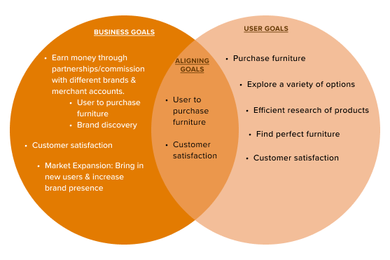
Goals
Understanding the process
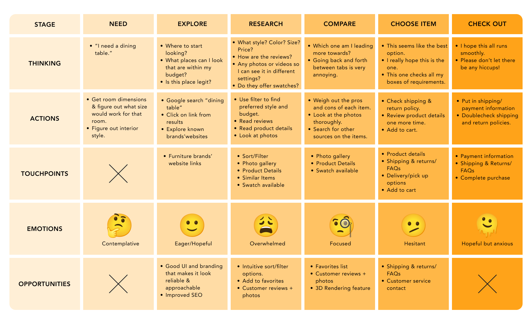
In order to understand and empathize with my participants, I crafted a journey map to identify where pain points emerged in the process and what features would be helpful for the user experience.
Gathering intel on the competition
Initially, I believed my competitors would be other furniture stores, but upon closer examination, I recognized that the competition lay in the features rather than the products offered. They were sites that offer intuitive product discovery features such as Google Shopping, pulling products from different sites; and Pinterest, with their image search feature. Pepperfry, though a furniture website, offered features, such as furniture customization and merchant accounts, that could improve product discovery.

IDEATION
Persona: Who is Mina?
Mina is the persona created from the goals and frustrations of my participants. With little to no access to a physical furniture store, Mina depends on online shopping. She finds that there is a wider variety of furniture online. She wishes that the product that she orders will look and feel just like how she imagined when doing her online research.

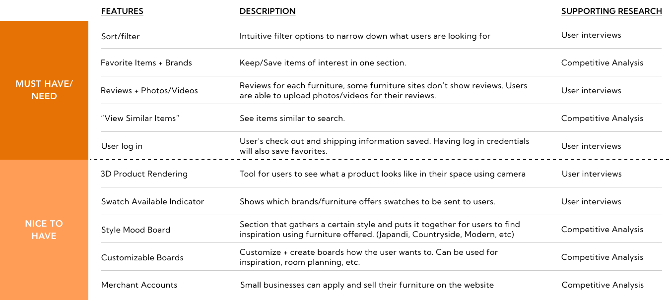
Needs vs. wants
The needs fulfill the fundamental aspects of product discovery and research functionality. Incorporating the wants would further enhance the integration of the in-store shopping experience for the user.
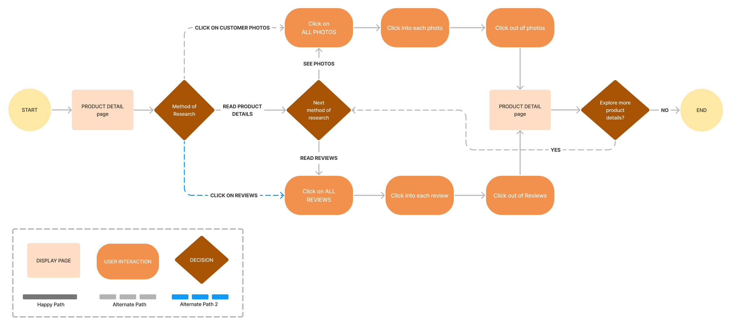
USER FLOWS
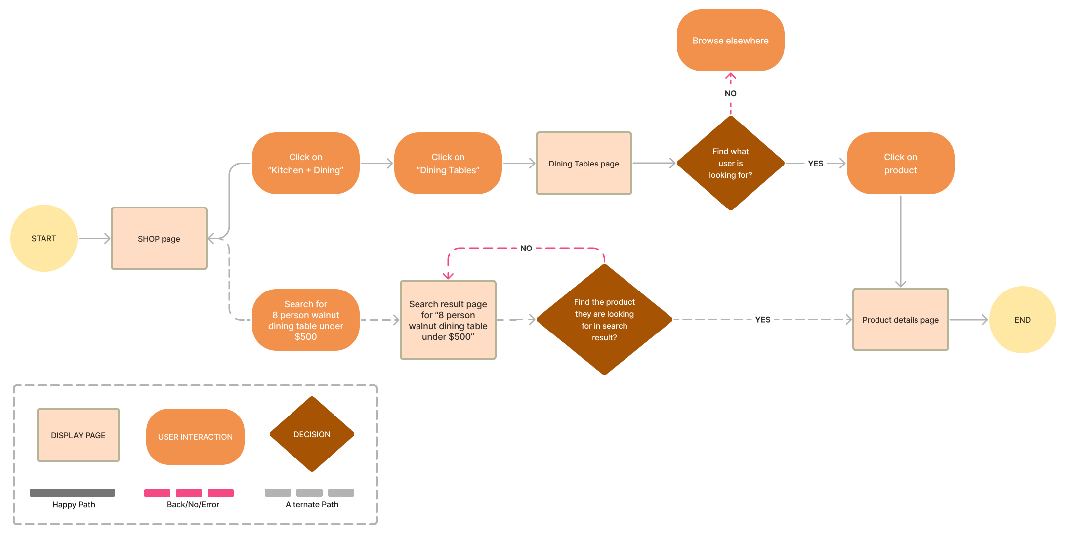
Search for an 8 person dining table, walnut colored, and costs under $500.
The first flow offers different search options, whether it be by using the search bar, going into the sub-categories, and/or utilizing the sort/filter feature.
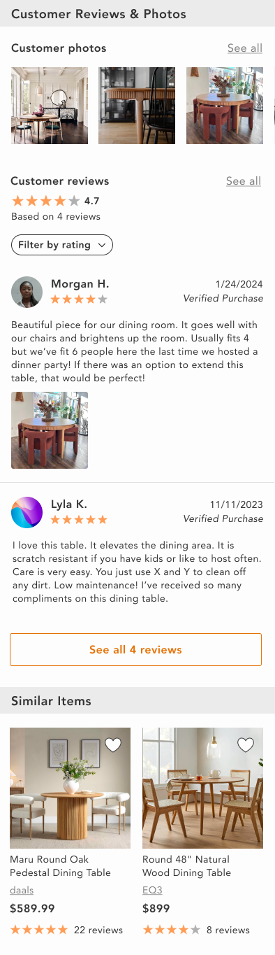
Look through customer reviews and their photos.
The second flow focuses on product research which allows users to explore different reviews and photos of a product.
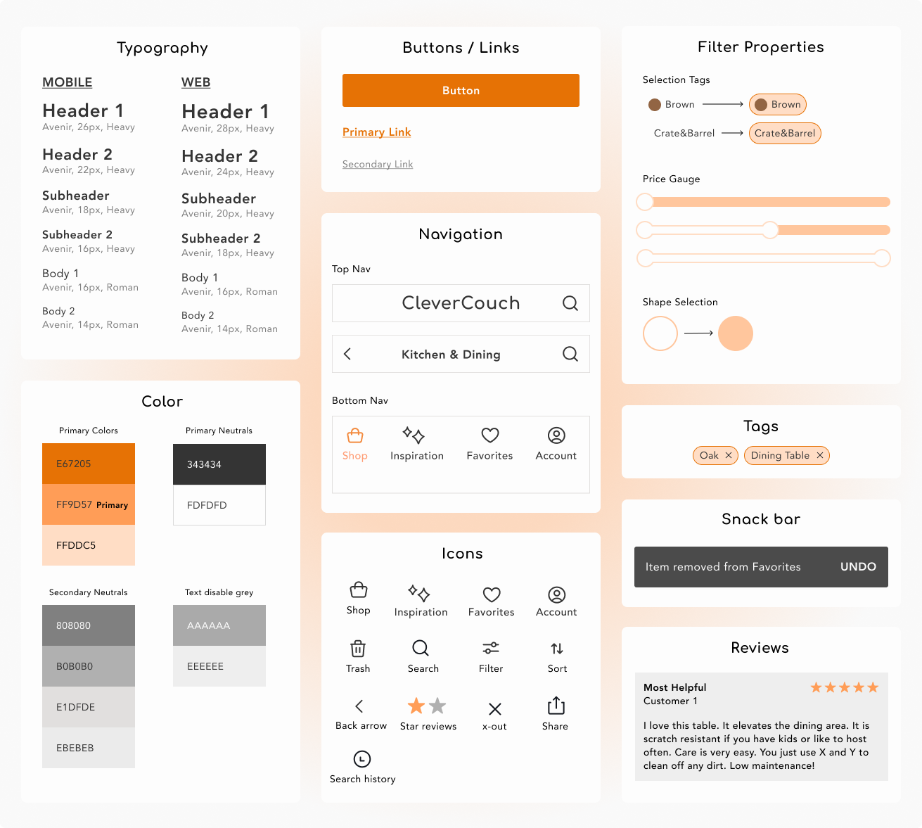
BRANDING + UI KIT
Simple. Warm. Approachable.
The goal was to keep it simple and straight to the point for a smooth user experience. A warm orange was chosen to express approachability deviating from a “luxurious” look that may steer some people looking for cost-friendly options away.
WIREFRAMES
Low fidelity wireframes
A visual rough draft of my tasks were created from my user flows.
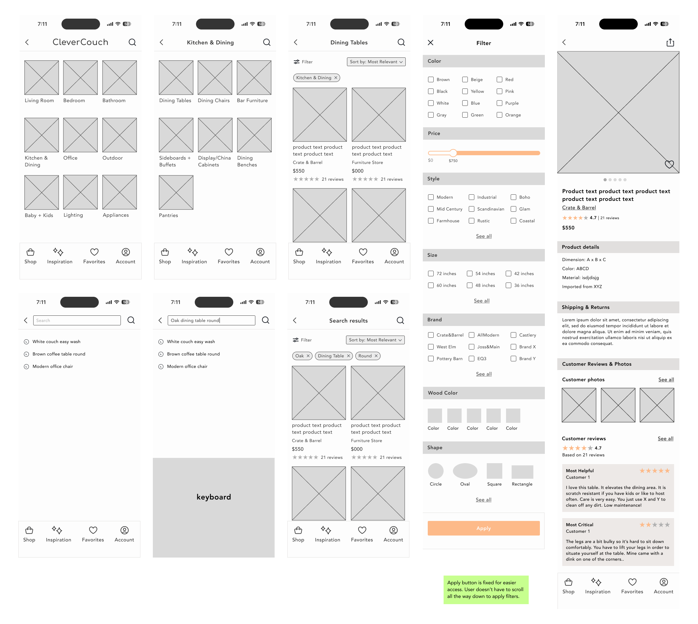
High fidelity design - First iteration
In accordance to my user flow and UI kit, I created a couple key screens to use as a guide for my usability testing and final prototype.
TESTING
Overview
I created an interactive prototype to enable participants to evaluate the workflow of specific tasks.
Tasks
Search for a dining table (brown, modern, 48", round)
Look/explore through customer reviews & photos.
Success metrics
There is little to no guidance on the tasks given.
Users are able to accomplish the tasks in a timely manner.
Results
All participants said that the app is simple, straight forward, and easy to use. They had no issues navigating and fulfilling the tasks given. However, they did notice a couple things that they believe would create a better experience. All of the iterations were in the product detail screen.
Sorting reviews by star ratings
Similar items feature in product detail screen
How reviews are highlighted as “most helpful” or “most critical”
Color contrast for accessibility
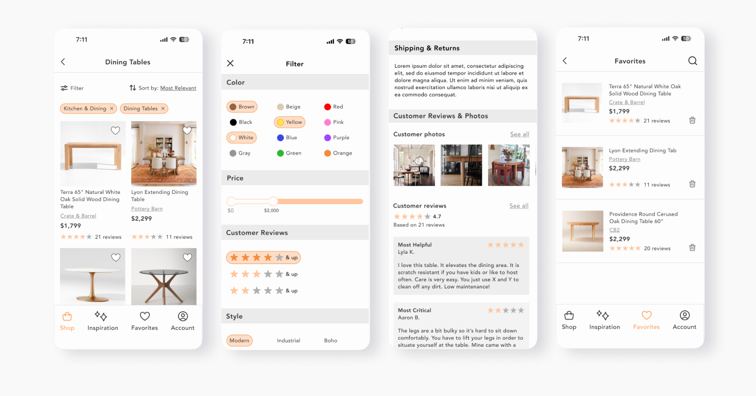
ITERATIONS

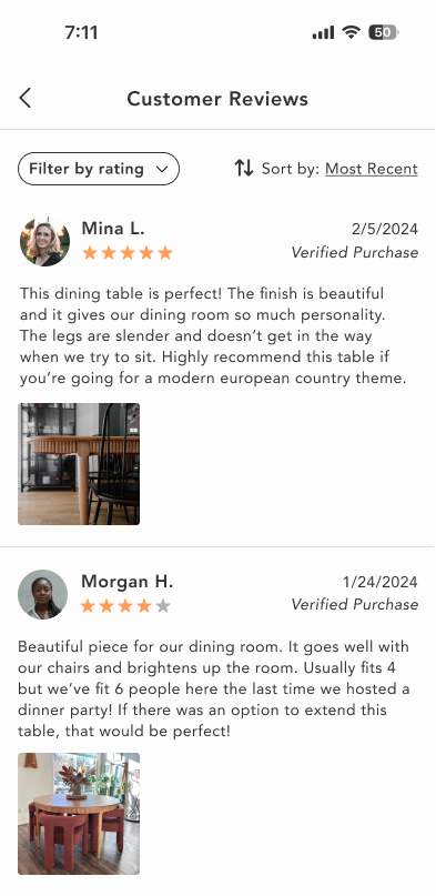
Sorting reviews by star ratings
Test results showed that people find reading the reviews important and want to read both the pros and cons of a product. To offer in depth product research to users, I added a filter by rating feature so that users can sort through with more flexibility and without having to scroll through endless reviews.
Increasing the color contrast
The orange in some components were too light for accessibility standards. Utilizing the webaim.org contrast checker, I increased the color intensity to fulfill the standards.
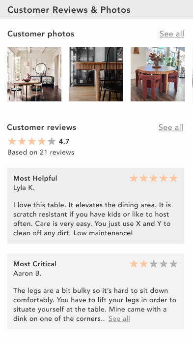
Remove “Most Helpful/Critical” reviews
As an MVP, it didn’t seem necessary to add a feature to promote a review to “most critical” or “most helpful”. It would most likely appear in a later version.
Add a “Similar Items” feature
Adding this feature would allow users to find items similar to what they’re searching for.
CONCLUSION
Throughout this project, I was always challenged with the question, “how do I make this stand out?” I wished to create something visually complex, but what would be the point if my users’ cannot use it? This gave me a peace of mind that while visuals pack a good punch, simplicity with intention is good too.
My next steps for this project would include interviewing a bigger audience, those casually looking and those looking with urgency to deeper understand different aspects and behaviors of furniture shopping. One feature I would love to add in a future version is a Merchant account. This would be for small businesses who can apply and sell their furniture online for more exposure and would allow more discovery to users.