
DATAFY
Conceptual donor database design for new nonprofit organizations.
OVERVIEW
Datafy is a web-based customer relation management (CRM) tool that stores and tracks donor and giving information. It captures this data through online donation forms on designated non-profit websites, seamlessly storing it within Datafy. Users can apply filters and generate reports on donor details and giving statistics.
This project is a proof of concept emphasizing UX research and visualized data for an MVP launch.
SCOPE
Responsive web design
Data Visualization
Web-first
ROLE
User research
UI design
Usability testing
TOOLS
Figma
Miro
DURATION
July to September 2023
THE CHALLENGE
A new nonprofit organization utilizes spreadsheets as its main tool for donor data management. They’d like a tool where information can be generated automatically.
THE SOLUTION
Design a responsive web-based dashboard that is simple and easy for users of all experience levels and manages data automatically.
RESEARCH
Interview
I started my research by engaging with three professionals affiliated with a non-profit organization. The experience levels varied from Director of Development to major gift officer to campus staff of a new student ministry.
To understand my participants' effective strategies and challenges, I explored their daily operations and key information they depend on to meet their goals. This insight will guide me in identifying useful features and improvement areas for designing a database tool tailored to users transitioning from spreadsheets to data management.
Some questions asked in the interview were about:
the non-profit organization’s business goals and aspirations,
what steps they take to achieve those goals,
the specific data necessary for them to procure the information they seek,
and how their data is organized within their respective tool.
Findings
One of the participants, a co-founder of a new student organization at a university, expressed that, because they’re new, a lot of the processes aren’t set in stone and everything is usually done on a whim. She manages all the org’s data on PayPal and spreadsheets and wishes for a tool in the future that offers automated processes and multi-user access.
“Our org is so small that we just don’t have a system. It’s our own DIY process. When people are asking for information I do a lot of manual work for sending out emails, sending thank you’s. I wish it was more streamlined.”
- Alex, Campus pastor of Agape Ecclesia
One theme I found between all three of my participants was that cultivating and building relations with donors is key in maintaining a flow in donations. Some phrases articulated during each interview included:
“connect and engage with more major and high net worth donors”
“increase community engagement”
“increase fundraising dollars and major donors”
“develop partnerships and meet new churches and folks capable of making large donations.”
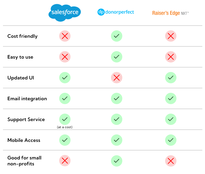
Competitor Analysis
I analyzed Salesforce, Donorperfect, and Raiser’s Edge. In two interviews, participants highlighted Salesforce as a potentially superior alternative to their current tools.
One notable weakness observed in some of these competitors' products is the steep learning curve. Salesforce offers a broader array of advanced features, consequently entailing a steeper learning curve. Raiser’s Edge was also on this list.
IDEATION
Persona
Variations in participant experience made it challenging to pinpoint common needs and frustrations. The first participant expressed a strong affinity for their tool, the second participant viewed their tool positively but suggested room for improvement, and the third participant depended on spreadsheets and PayPal exclusively for their operations.
I decided to focus on the challenges and needs of the second and third participants because they identified areas for improvement in their data processes. Then I focused on the goals and aspirations of all three participants to find common goals and motivations.

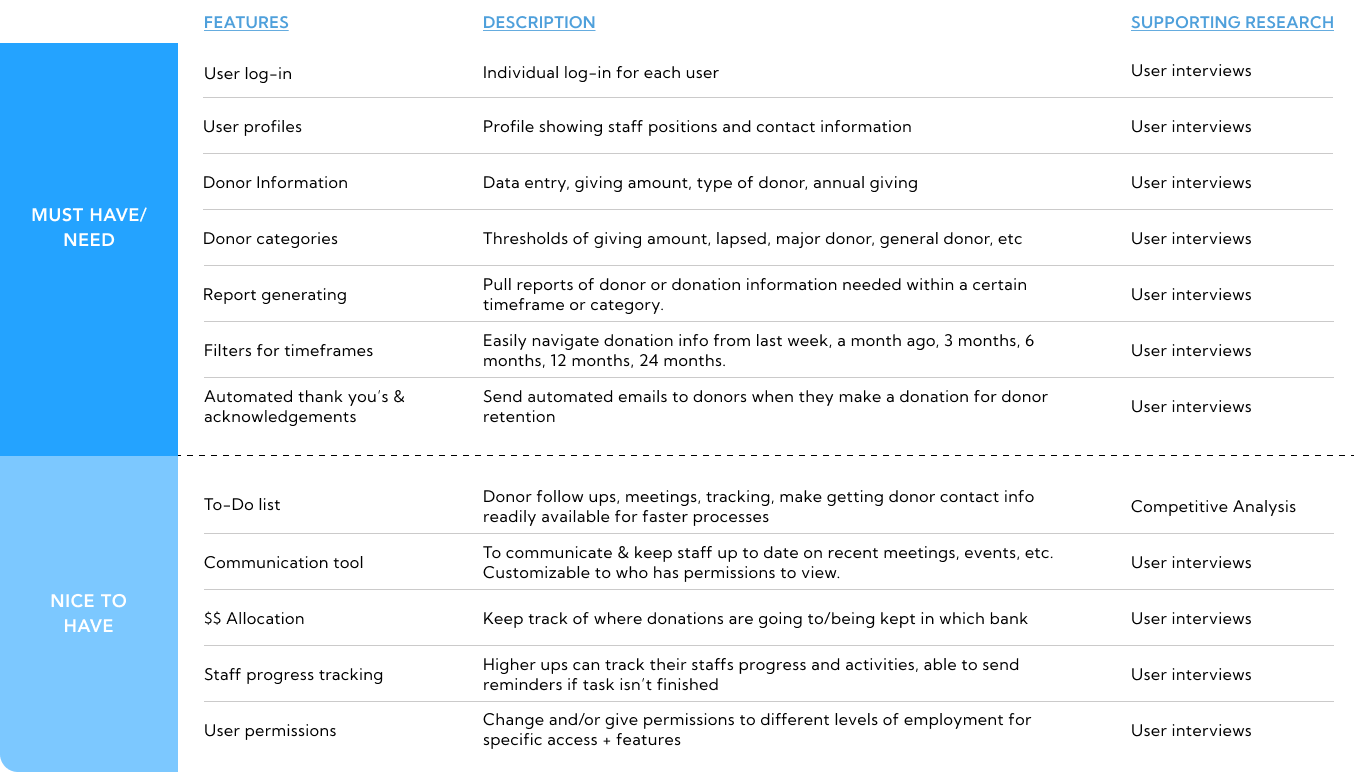
Feature roadmap
I created a list of useful features which address the needs and goals of my persona. Crafting an MVP, my focus was directed towards implementing features essential for the app's functionality. I prioritized my features asking myself the following questions:
what kind of data is needed to run daily/monthly/annual tasks?
what timeframes do users use when pulling reports?
is this feature vital to day to day tasks or would it help enhance the experience?
does it address the needs and goals of my persona?
USER FLOWS
Find total donation amount from the past 6 months for printing
Pulling multiple reports is a part of all three of my participants’ daily tasks. Pulling them helps to gauge progress on incoming donations, donor relations, areas of improvement, etc.

Search for donor to contact them with a thank you
Cultivating and sustaining relationships with donors constitutes one of the most effective ways for soliciting donations according to my interviews. This feature aligns with the persona’s goals and motivations to engage with current and potential donors.

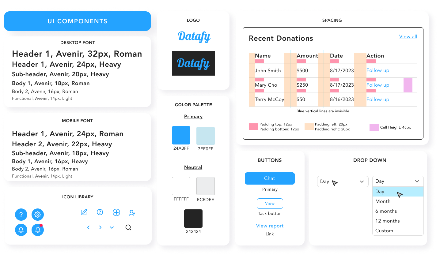
BRANDING + UI KIT
Approachable, minimal, informative, efficient
These were the values I wanted my product to embody to meet the needs of my persona. Since this product is focused on data, I kept my branding minimal and simple.
I tested around with color, bouncing between blue and green. I decided with blue because it expressed a sense of security and dependability.
WIREFRAMING
High fidelity design - First iteration
I designed key screens for my high-fidelity wireframes that reflect my UI kit and user flows. With this as a guide, I moved on to testing and reiterations.
TESTING
Overview

Two participants have no non-profit experience or experience using a CRM product.
One has volunteered at a non-profit briefly.

Search for a donor to contact them with a thank you.
Find total amount of donations in the last 6 months to print as a report.
Users are able to complete task with little to no guidance.
Users are able to complete task in a timely manner.
Results
Task 1: Search for a donor to contact them with a thank you.
Highlights:
Approachable, clean design.
Charts & graphs are helpful in showing data.
Area of Improvement
“Is the top search bar a fuzzy search or an exact search?
Task 2: Find the total amount of giving in the last 6 months to print as report.
Highlights:
Good use of color
The action button is in a familiar place
Areas of Improvement
“Can we view more of the report in detail?”
“Is there a column filtering each category on the list at the bottom?
ITERATIONS
Flexibility in sorting information

I added arrows to each column for flexible sorting, allowing users to filter the donor/giving list by name, solicitation, date, or donation type.
Exact search to fuzzy search
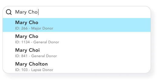
There was confusion about the function of the top search bar compared to the search bar in the list in the bottom half of the dashboard. To clarify, I made the top search bar a fuzzy search for finding specific and similar items.
An in depth view of reports
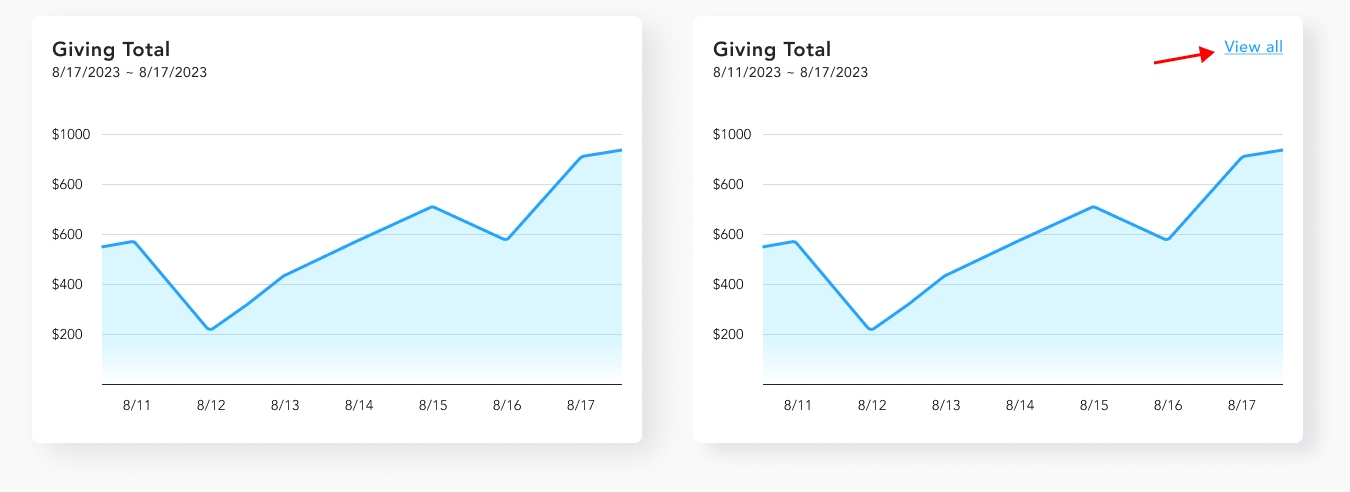
I added the “view all” links on graphs so that users can click on it and see an in depth view on this information. Also able to generate into a report instead of generating an overview page.
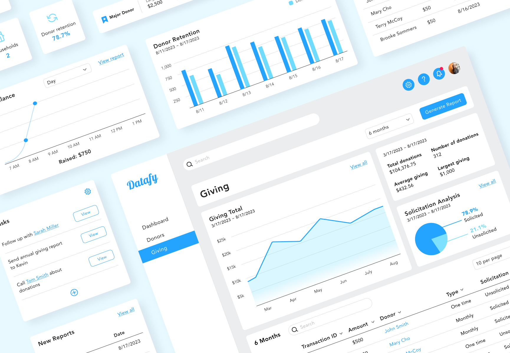
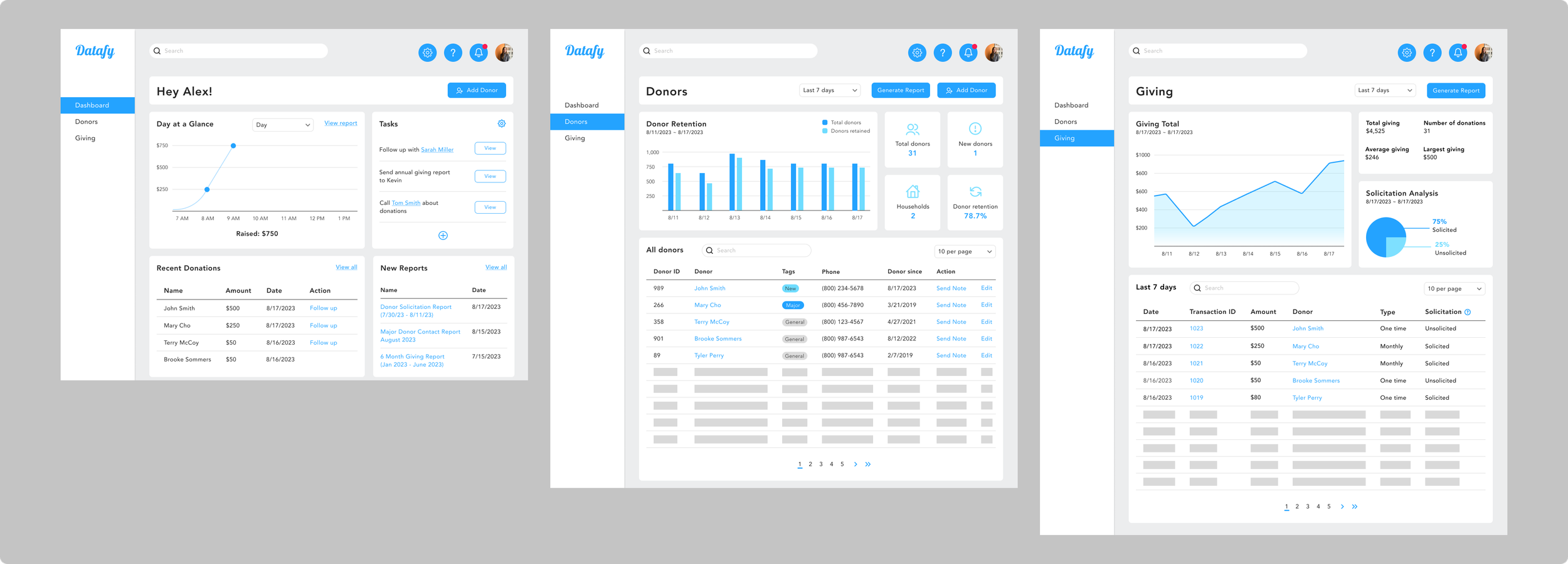
FINAL PROTOTYPE
After usability testing and reiterations, my final deliverable was an interactive high-fidelity prototype. I incorporated user feedback into my prototype to be ready for design hand off.
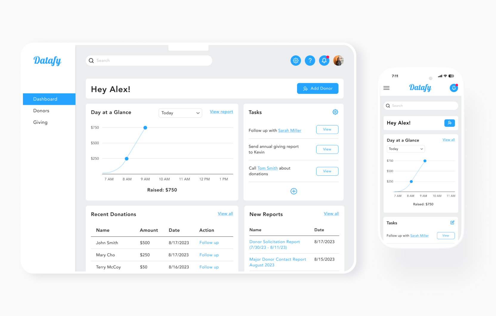
User Dashboard - Desktop + Mobile Screens

Donor Profile - Desktop + Mobile Screens
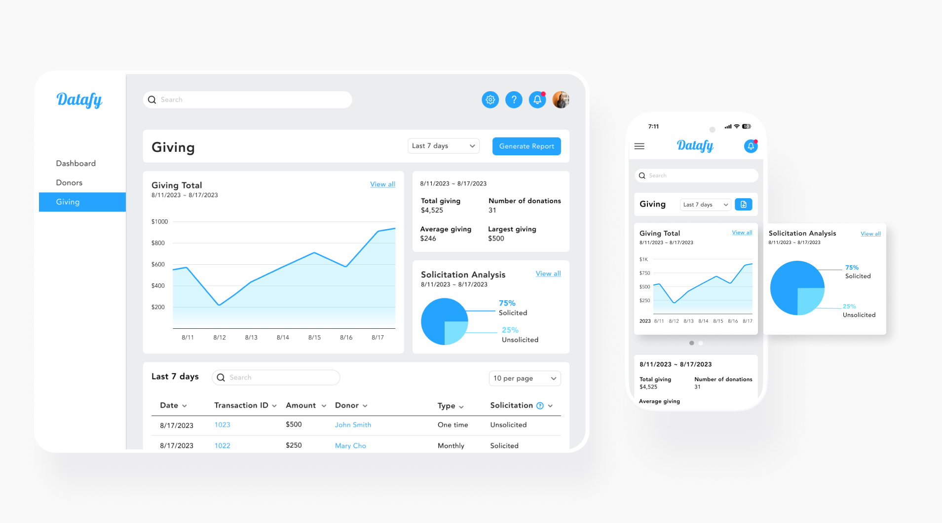
Giving Page - Desktop + Mobile Screens

Donors Page - Desktop Screen
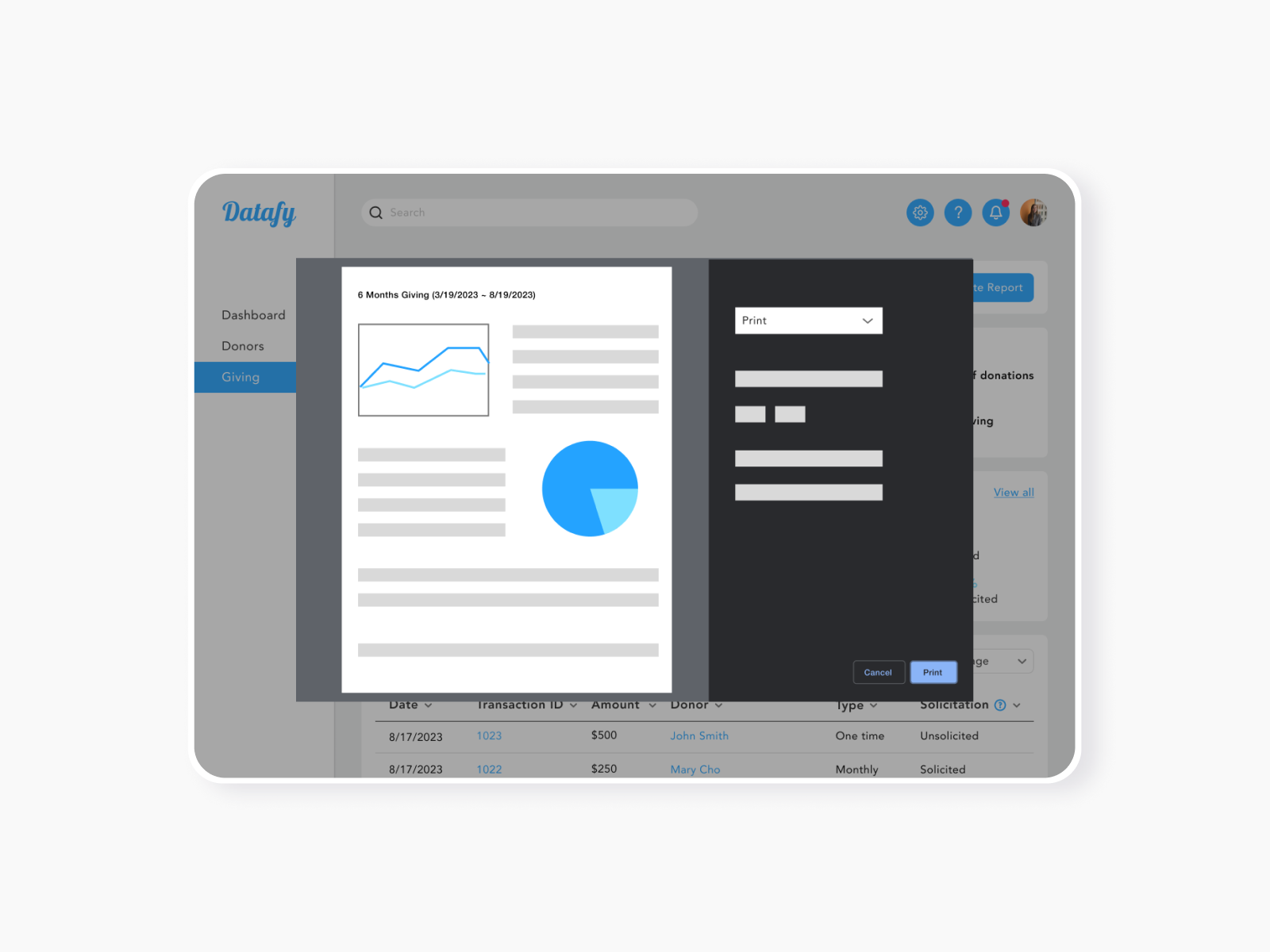
Pulling Report Modal - Desktop
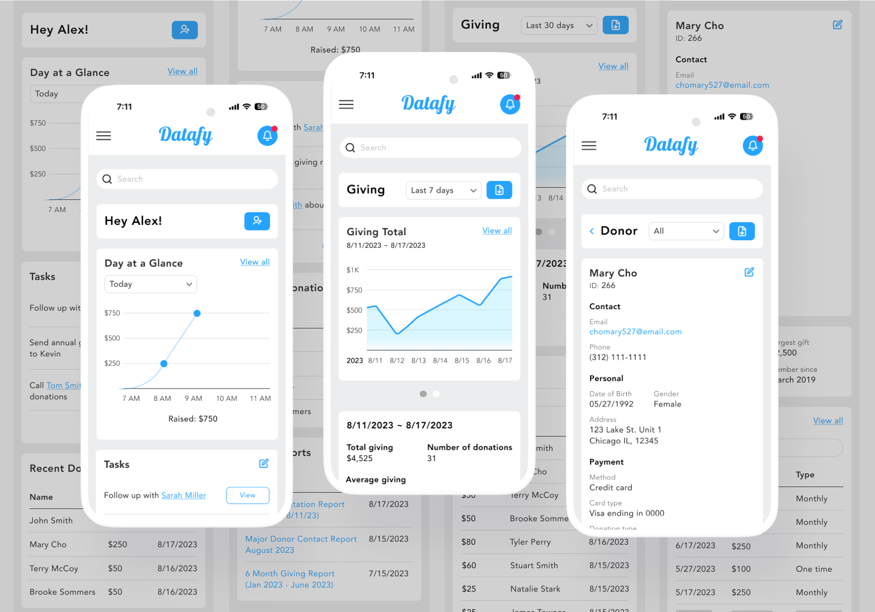
Mobile Screens
CONCLUSION
My research shows that managing data on spreadsheets is tedious and time-consuming. Creating a user persona helped me identify goals and pain points, refining the issue and formulating a solution.
Focusing on the needs clarified the design process, despite the initial challenge of prioritizing features.
The development of Datafy afforded me valuable insights into the potential of working with web-based databases.
As Datafy is currently in its MVP stage, the next steps involve using it as a springboard for further innovation and refinement. Conducting interviews with users possessing nonprofit experience would be instrumental in pinpointing the next feature.