UNITED AIRLINES
Feature add on for a worry-free and seamless airport navigation

OVERVIEW
United Airlines, Inc. is a prominent American airline headquartered in Chicago, Illinois that offers a user-friendly app for planning, tracking, and booking flights.
Despite the user-friendly design, travelers remain anxious about potentially missing their flights. This influences their dining and exploration, limiting their choices, primarily due to a lack of real-time transparency.
This independent project is a proof of concept that introduces a feature add-on developed through user research to provide transparent time management for a comfortable airport experience.
PROJECT TYPE
Feature Add-on
MVP
ROLE
User Research
Prototyping
Usability Testing
TOOL
Figma
DURATION
October to
December 2023
THE PROCESS

THE CHALLENGE
When exploring and dining at the airport, users' decisions are influenced by the fear of missing one's flight due to lack of time transparency.
THE SOLUTION
Implement features that enhance time transparency, offering users real-time estimates to reach their gate and facilitating the airport exploration.

RESEARCH
Participants who travel between 3 to 5+ times annually and actively use airline apps were interviewed. I delved into their behavioral patterns at the airport, exploring the reasons behind their actions and choices.
Interview Questions
Some questions asked in the interview were about:
planning and timing of their airport arrival,
what they do once they’re past the security checkpoint,
dining/exploration habits,
how they utilize the airport apps,
and frustrations with their airport experience.
Insights
Underutilization of the airport map: The airport map isn’t frequently used because passengers are often unaware of its existence, it requires extra steps to access, or it lacks automatic location detection, making it difficult to use in large or unfamiliar airports.
Gate first, then explore: All participants prioritize going to their gate before exploring the airport. They do this to verify gate and flight details and to evaluate food and amenity options along the way.
Challenges in navigation and dining decisions: Participants face challenges navigating the airport and choosing where to eat. They consider gate distance, wait times, crowdedness, and returning to the gate on time. Despite using signage, 60% of participants struggled with finding their gate due to getting lost at unfamiliar airports and long walking distances (signage does not provide information on distance).
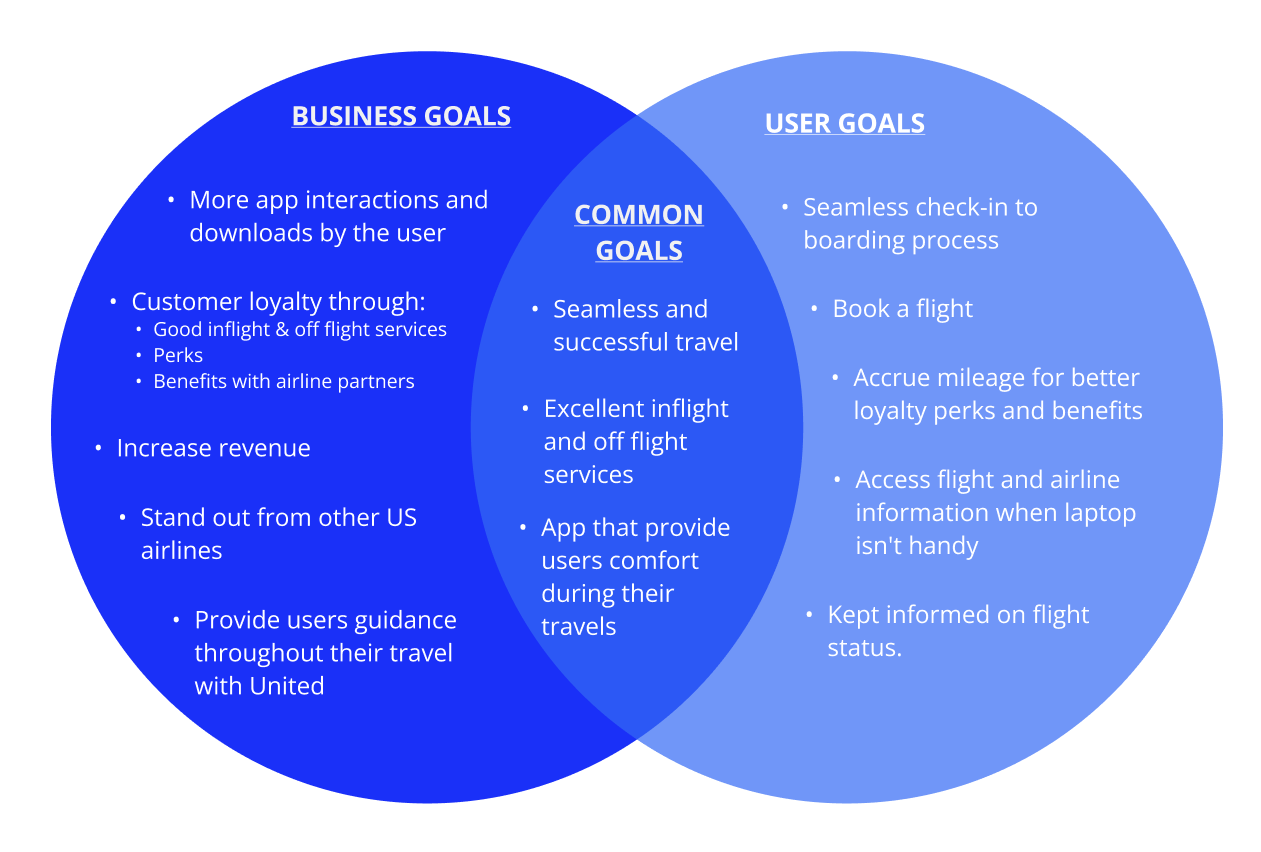
These insights revealed a common thread: Decisions are primarily driven by the fear of missing their flight due to an absence of real-time transparency.

IDEATION
Goals
Persona: Jeanne the Frequent Flyer
Interview participants shared similar airport experiences, with a common concern being the fear of missing their flight. Despite varied needs and goals, they all struggled with the lack of real-time information about gate distances and wait times at stores and restaurants in the terminals.
The challenges encompassing all participants' concerns prompted the development of a persona, Jeanne.


USER FLOWS
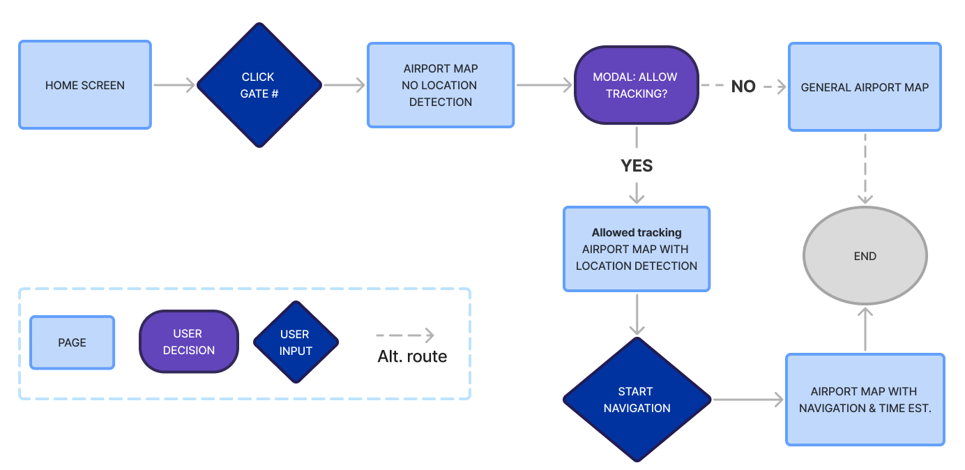
Find the estimated time to the gate, then get directions to the gate.
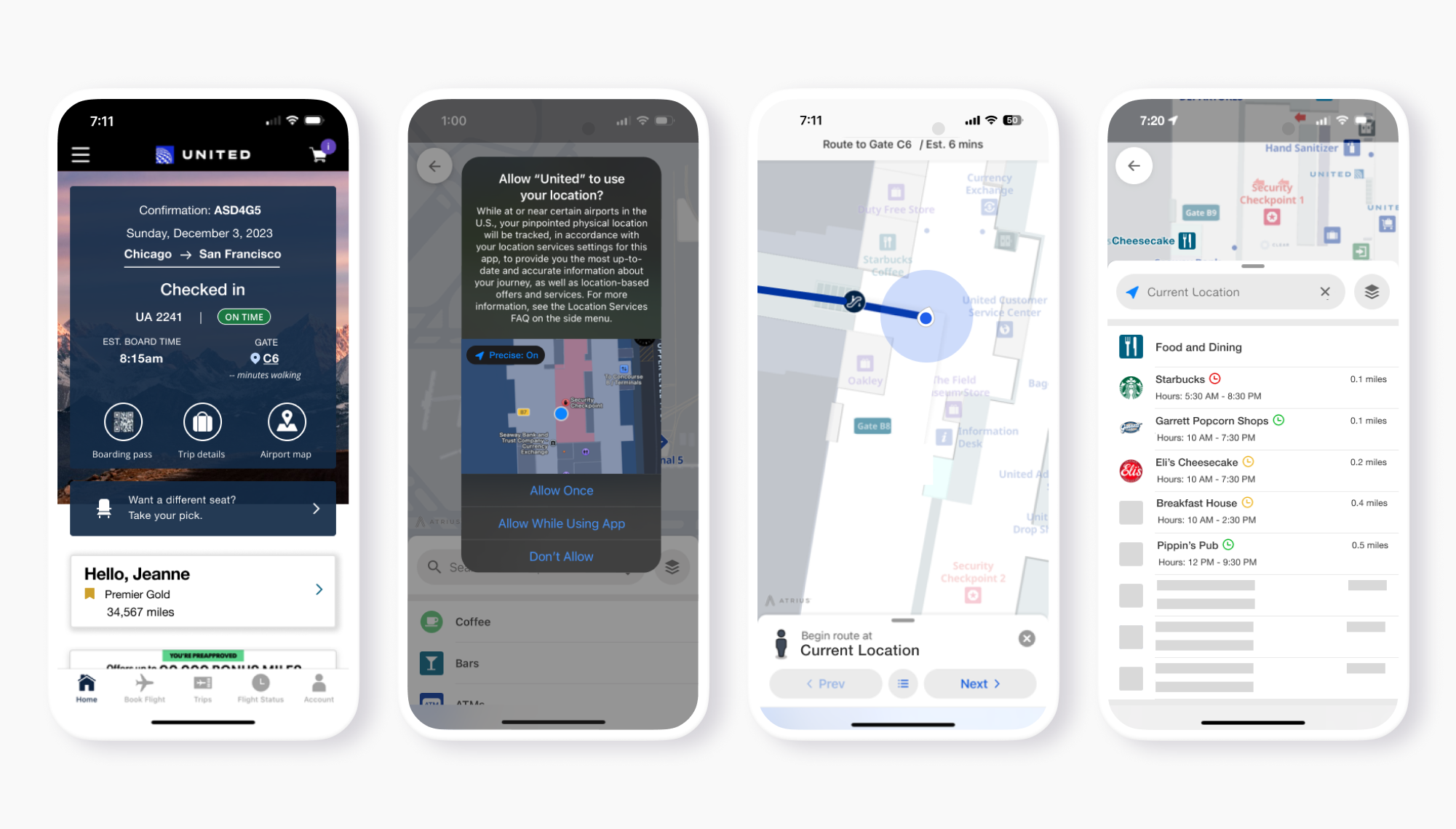
I designed a flow to estimate time and provide directions to an airport gate. Users can enable GPS for automatic directions, otherwise, they’d have to input their location manually. Users start by clicking their gate number on the boarding pass or home screen to access the airport map.
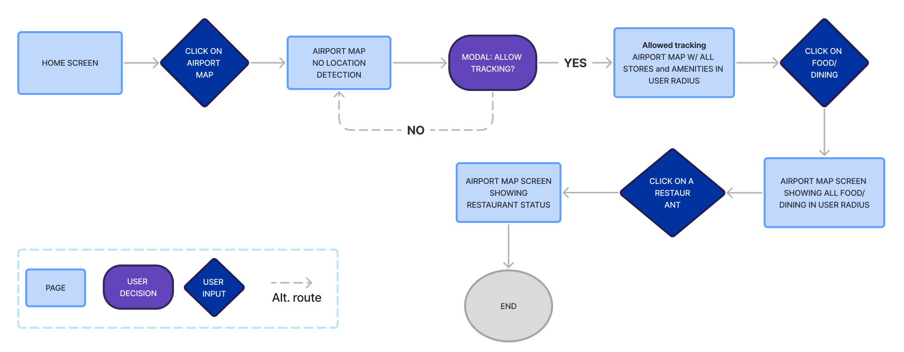
Open the airport map and see the restaurant status.
To help users avoid missing flights due to unpredictable wait times at restaurants, I created a flow that shows restaurant busyness based on trends or user data. Users can access this information via the airport map from the home screen, with location tracking for detailed wait times and distances or without it for general map information.

PROTOTYPING
Rough draft
Low fidelity wireframes were created to reflect the user flows.

High Fid wireframes - First iteration
An interactive high-fidelity prototype was created, supported by my research. This is the first version to be used for conducting usability testing and iterations.

TESTING
Overview

Participants
- Five participants took my usability test.
- All five participants travel frequently and utilize airline apps.

Tasks
1. Find the estimated time to the gate, then get directions to the gate.
2. Open the airport map and see the restaurant status.

Success metrics
1. Participants can accomplish the tasks with little to no guidance.
2. Participants can easily understand the added feature and its components.
Results
Following the completion of my usability test, I organized the findings and outcomes by prioritizing them. I mainly focused on iterating my high priority because participants expressed the same concern.
High priority
The clock icon — All participants were puzzled by the significance of the clock icon next to the store names. Initially, many assumed it meant hours of operation.

Mid priority
Location of airport map — one participant was looking for it at the bottom of the screen and not where flight information was. They mentioned that typically, all flight information is consolidated, with other details segregated into a separate section.

Iteration through prioritization

Since all participants were confused by the clock icon next to the store names, I changed it to be more straight forward which could be understood by most users.
The mid-priority airport map location was not iterated on because most participants had no issue finding it.

FINAL PROTOTYPE
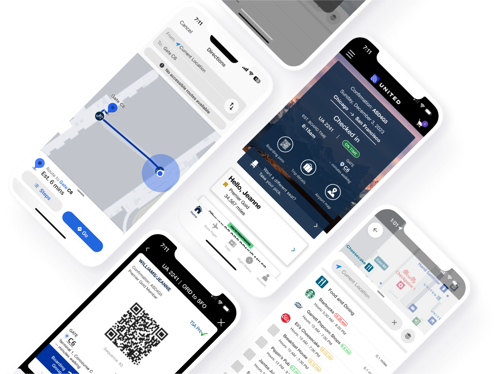
After usability testing and reiterations, my final deliverable was an interactive high-fidelity prototype. I incorporated user feedback into my prototype to be ready for design hand off.

CONCLUSION
My research highlights the demand for users seeking a smooth airport navigation and exploration experience, alleviating concerns about extended wait times and unexpected distances to walk. What they sought was transparency in estimated time.
By integrating a map feature that auto-locates the user (with permission), the process is streamlined compared to manual entry of both start and destination. This improves transparency in gate arrival estimates and also, when combined with wait times for desired establishments, assures users they can return to their gate before boarding.
Next steps would involve interviewing a wider audience, including infrequent travelers, to uncover their needs, or focusing on refining the dining/exploration experience.
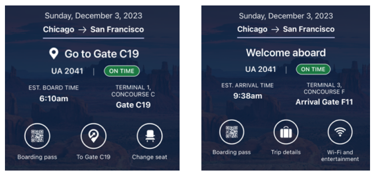
Disclaimer: While designing my wireframes, I flew with United and found that they've added a feature similar to this project. United's feature provides real-time updates on flight and user status, adjusting after each checkpoint (check-in, post-security, boarding, landing) using precise location tracking.
The idea for the auto-locate feature wasn't inspired by this recent addition since one cannot experience this unless they are flying with United, which I haven’t since January of 2023. Back then they did not offer this feature. This idea was backed by research showcased in this case study.